
January 10 - January 31
Research • Analysis • Product design • Information Architecture
Research best practices and use the IRL branding to create new, exciting emails for their platform
IRL (or “In Real Life”) is an app that makes it easy and fun to send and receive invites to hang out with friends in real life. The app also features a series of suggestions for invites that users can send, which change regularly based on users’ interests or location, seasons and upcoming holidays. Its mission is to solve technology addiction and bring people together in real life rather than through screens. Like any social media or consumer service app, a user must generally connect their email as a means of creating an account. Therefore, emails are a necessary form of communication to the user to better engage with the app.
Problem
IRL has several email templates that are in need of a new design. The current templates are bland, boring and do not provide much information on what differentiates IRL to new users.
Expected Deliverables
1) Documentation on what I found on best practices for emails and incorporating the IRL branding on the email templates
2) Complete email designs ready for developer handoff in Figma For the redesign portion of the project, I was asked to work with IRL’s brand designer and our current product designers to redesign these emails:
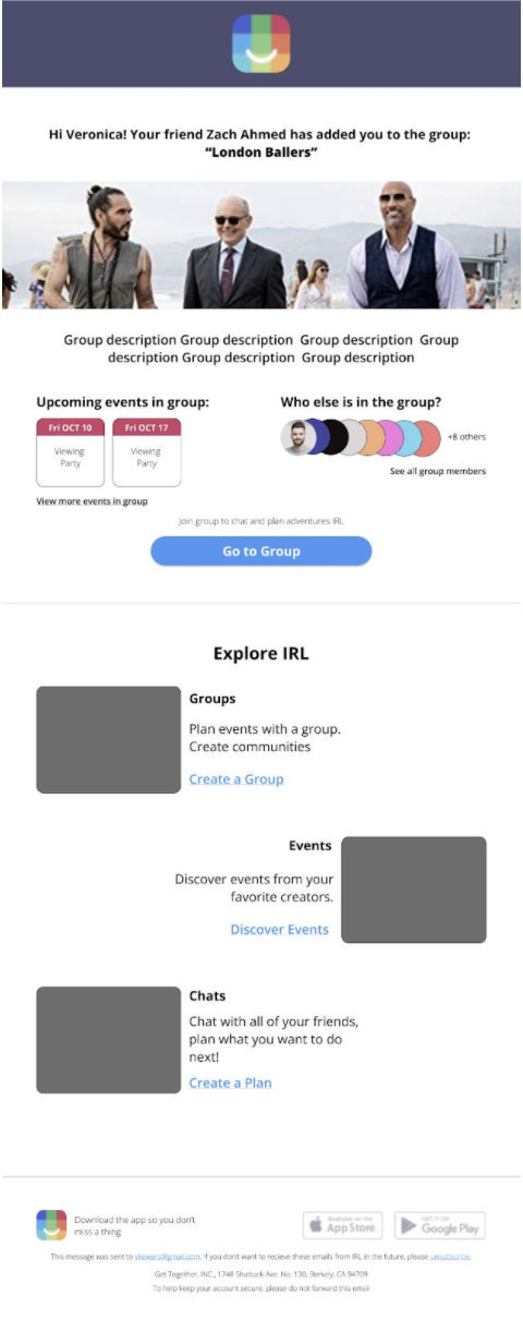
Invite to group email:
The email is sent to non-irl users and irl users inviting them to a group. The email should provide:
• Basic information about the group (title, description, who invited you to the group)
• Give some information about what IRL is to users who are not familiar with the platform
Invite to event email:
The email is sent to non-irl users and irl users inviting them to an event. The email should provide:
• Basic information about the event (title, description, time, date, location, who invited you)
A generic IRL template that we could plug and play content into:
Design a header and footer, with space in the body of the email for a message and a button/Call to Action. Something like the below:

After speaking with both the brand designer and one of the product designers, I began my research with a competitive analysis of other social media and consumer service company transactional emails. I wanted to identify pros and cons of the information architecture as well as the design of each company’s email. I looked at:

Pros:
• Single column layout
• Using images helps users connect to the brand
• Gives users multiple options (several CTAs) to explore app and learn more (helping users learn the different features of the app)
• Translates well to mobileGreat use of images
Cons:
• Bland with no catchy headline
• Cognitively overwhelming; user has to read through the descriptions to understand the CTA and decide to follow through on the action
Pros:
• Bright bands on top and bottom exhibiting the brand
• Obvious CTA
• Text is large and legible
• Content is fun and excitable/keeps the user engaged
Cons:
• A bit wordy
• Headline doesn't grasp the user's attention

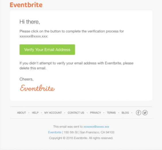
Pros:
• Clear purpose of email
• Brief and to the point
• User has clear CTA for next steps and action to take
Cons:
• Lack of imagery
• First email, not personable/does not name the user

I also looked at LinkedIn and Venmo promotional emails. It was, however, important to note the differences in design between transactional and promotional emails because transactional emails tended to have less information - more direct and to the point. This is compared to the promotional emails that are not triggered by a users’ action, but sent out by the company as a means to engage its users.
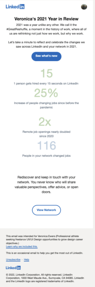
Pros:
• Clear CTA
• Even spacing with information that draws users in (statistics)
• Secondary CTA is an option below but shadows the main CTA
• Content provides data that gives users an idea of what the company provides
• Proactive in providing users information they may eventually have wanted
Cons:
• Not as visually appealing/grasping as other emails
• Wordy (lack of images)
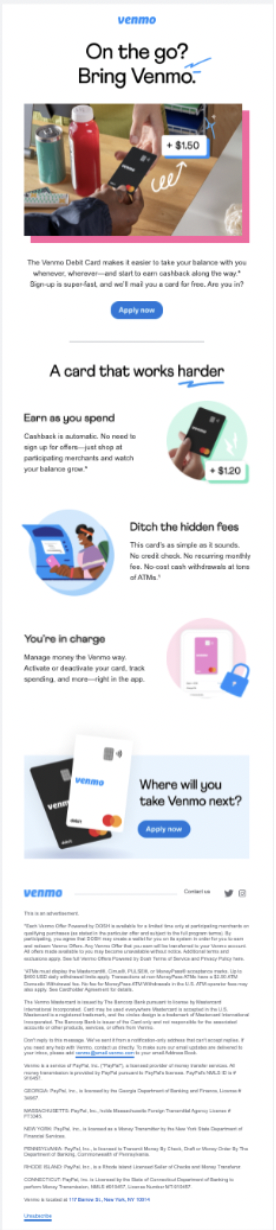
Pros:
• Catchy title to grab the user
• Flow guides user from top to bottom with images (and their descriptions)
• Hero story to grab users' attentions and to help explain what the app does for the user
• Translates well to mobile
• Catchy headline
• Great use of images
Cons:
• Though the flow is visually and cognitively appealing, there are no additional CTAs (for example, to "learn more")
• Though the flow does guide the user down from top to bottom, the bouncing from left to right in the content below the hero story could create some cognitive stress rather than guiding the user down the screen smoothly
I wanted to then break down IRL’s current emails and render an analysis of their emails based on the pros and cons I’d identified in competitor emails. I came into this project with fairly fresh eyes, therefore I felt I could go at my analysis with an unbiased lens.
These are the current emails I was asked to redesign, as well as my general understanding of their purpose:
The purpose of this email is to get the user excited to be a part of the group they’ve been invited to join and to let the user know what options they have now that they have been invited to this particular group.
The purpose of this email is to get the user excited about the event they’ve been invited to and to provide something for the user to look forward to.
The purpose of this email was not so clear to me. I originally struggled working on this email template because I wasn’t sure of its purpose. Most transactional emails are triggered by an action performed by the user, however this does not appear to be a direct action performed by the recipient of this email. (I later spoke with the brand designer and product designer and determined they ultimately wanted some kind of general template to use if and when there was another simple transaction, such as a change in password or update to their profile).
From reviewing these emails, I extracted a several critiques:
Not much imagery
• Imagery could/can explain/provide better detail of the event to or group to which the user has been invited
• Get user excited for the event/group
• "Groups"/"Events"/"Chats" is a bit lost and easy to scan over
• As mentioned, use users' full names instead of username
• Provide brief explanation of the group/event?
• Not very colorful. Though the icon for IRL is vibrant, the email should also be vibrant to reflect the brand
• Suggest other events when user is invited to an event- draw users into the app
• Email to user isn't very personable; say hello to the user and make the email almost conversational (but brief)
From the research I completed on transactional emails as well as the analysis I’d rendered of IRL’s emails as well as the competitor emails, I ended on several key takeaways and developed subsequent recommendations.
I broke my recommendations out into two focal topics: Design and Information.
Design
• Bright eye-catching colors to express brand
• Single column layout guides creates flow
• Needs to stand out so user doesn’t automatically put into spam or unsubscribe - Don’t want to turn users away
• SIMPLE/reduce cognitive load/strain
• 60-30-10 rule for color proportion
Information
• Single column layout creates engaging flow for the user to continue learning about and engaging with the product
• Hero story to help user know what the product/company is all about
• Overall purpose of any email is to keep company’s users engaged and to keep them excited about the product/service
• Subject line of emails needs to draw user in/gain user’s attention to generate curiosity and have them open the email in the first place
• Email needs: user benefit, catchy headline, solution driven sub-headline
• Make email skimmable
I brought my findings and recommendations to the brand designer and product designer and we discussed the purpose of the IRL emails and their limitations in developing emails prior to my moving into sketching possible redesigns. A big limitation has been the amount of information they are able to include in emails that are personalized to the user/email recipient. They hope to eventually be able to personalize emails based on the user’s location, however that is currently not within their scope. For next steps, I was given free reign for the designs, but they highlighted wanting a clear indication that I’d thought about the flow of the email; how the header, body and footer were broken up and what information would be available in each email.
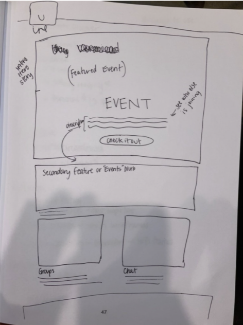
With this design freedom, I created low fidelity designs of each email. For both the “Invite to Event” and the “Invite to Group” email, I created low fidelity sketches on Figma, as seen here:
I wanted to highlight the information that would be useful for the users. On the event email that would be the: who, when and where. On the group email that would be: what, who and when. The biggest difference between the two is that the event has a clear, singular event, whereas the group has potential upcoming events, however the “what” and the “who” are the most important.
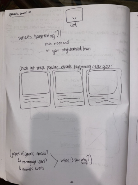
Sketching the “generic email template”, I was still a bit confused as to what user action would trigger a user to receive it. So, I sketched what I believed would be more of a promotional email rather than a transactional one; a ‘daily digest’ kind of email. I sketched several options:
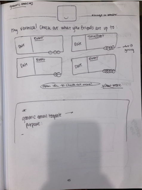
I brought these ideas to the product and brand designers and was given useful feedback. We discussed in further detail what would likely be found on both emails. For example, for the group email, it is unlikely there would be ‘upcoming events’ within the groups. There may be events within some groups, but the majority of groups would not have upcoming events. For the event email, because an event is live, it would be hard to indicate how many people would ultimately be attending the event as the participation would increase as the date got closer. Regarding the generic email, IRL primarily needs a blank email template that would have a nice header, body space and footer consistent in design to the other emails. After this discussion, I was given a few more clear objectives on which to focus. These included:
• Prioritizing mobile-friendly designs
• Working on button and font size
• Maneuvering content layout
• Continuing to iterate on the “Explore IRL” module
• Designing this module using icons and different CTA styles as well as imagery
• Working through type and information hierarchy
With these focal points to hone in on, I moved onto my final iteration.
Given the feedback and discussion after my sketches and low fidelity designs, I wanted to create a style guide laying out the font and color schemes (following their brand) as well as button sizing and iconography. After creating the style guide, I began to iterate on my low fidelity designs, taking into account the items we had discussed focusing on.
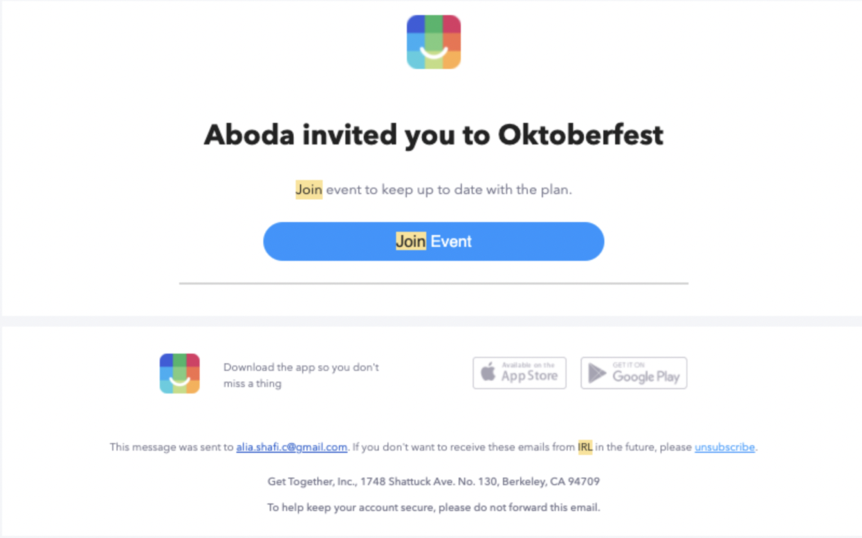
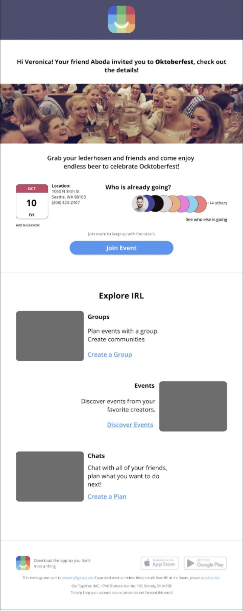
First, I worked on the “Invite to Event” email:


I wanted to make sure the email was personable to the user. So, in this instance, the email greets the user and makes them aware of what triggered the email to be sent to them. I made sure to keep the “when” highlighted on this email, as it is the most important information the viewer needs out of this email.
I moved onto the “Explore IRL” module, using imagery on the desktop version and also creating a version for mobile with icons. I made the decision with my designs to use images instead of icons for the desktop version as, per my research, images are more engaging for the user, particularly on desktop. However, icons are useful for the mobile design as an image can take up a lot of space and overwhelm the cognitive load.
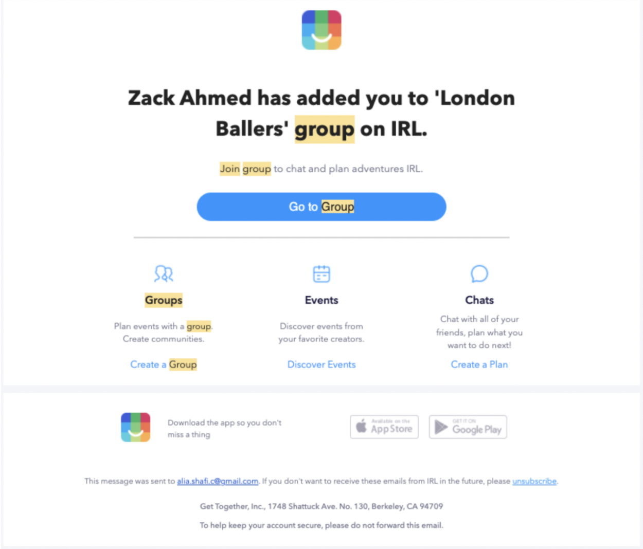
I then worked on the “Invite to Group” email:


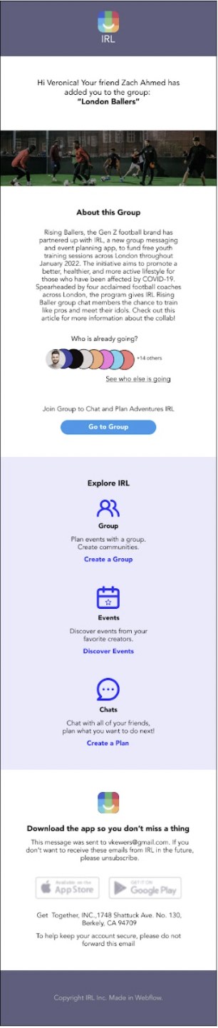
Similar to the “invite to event” email, the email is personable, and acknowledges the user directly while providing information as to why they are receiving this email. The most important information the user needs from this email is an explanation of the group/what it is they have been invited to join. Though the number of participants in the group could change, I still found the “who is going” to be useful information for the user because it would provide the user a means to get excited to be a part of this group to which they’ve been invited.
I kept the same, consistent “explore IRL” section as well as the footer for both the desktop and mobile versions.
Finally, I created a very basic “Generic Email” template:

.jpg)
%20(1).jpg)
The generic email was simple in that I just used the same general flow from the previous two emails, and removed the bulk of the information. There is a consistent header, and image in the body, the main CTA, the Explore IRL module and the footer. The actionable items are still very much present and there are areas to place the necessary information. You can view the final iteration screens and a broken down style guide here.
With these final iterations, I had my final meeting with the main stakeholders (including the product and brand designer with whom I’d been working) and presented my deliverables. We had a very good discussion about my iterations and was presented with this feedback:
Positive
• The segment blocking was great
• The footer was taken into consideration and is very good - would want to match the font and button color to the existing app
• Excellent choice of iconography
• The footer is great to have a CTA to download the app
Things to Consider/Improve Upon
• Consider Zero state
• What happens if we do not have metadata?
• What if there are invites to show?
• Think of where to use illustrations vs icons
• Explore different buttons, and different versions
• Consider if these structure are possible to create in an email template as well, e.g. some of these design may not be easy to implement by the clients
Ultimately, the stakeholders were happy with my final project iteration and indicated they would likely pass on what I’d created to their designers to work on iterating further. Given the timeline, I was unable to continue iterating on the email redesign, however they asked that I keep in contact with them and connect with them if I continue to iterate on these designs on my own time as they would greatly appreciate my input/design work.
Working with IRL and jumping into a designer position with a startup was an invaluable experience. I believe in most circumstances, as a designer at a startup, I will be given a very broad description of what is needed and therefore, given a lot of freedom in the direction I am able to take the product. I was able to experience the process of having that freedom, bringing in my ideas and research, and then honing in on those ideas and focusing on certain areas of the product (e.g.: icons, mobile, information hierarchy, etc).
Fortunately, IRL has a very collaborative culture and it was easy for me to bring my ideas to our meetings and have a discussion addressing those ideas while capturing where I could do more research or what I could improve. This project really prepared me for what joining a startup as a designer might look like and I believe I would do well in that atmosphere. If I were to continue, I would want to connect with the rest of the team (engineers, project managers, etc) and iterate designs until there was a final product that was ready for launch. In addition to those iterations, I would also want to participate in A/B testing of the different emails to see which designs were most successful. The team with whom I worked was excited to have my final iterations for this project and are open to me continuing to work on the redesign of their emails as it is something they have had on the backburner for quite some time, but haven’t had the ability to get to. I will continue to work on playing around with the redesign of these emails and see if I can provide a design they might want to launch. It would be a great experience to see my work get built into an app with over 20 million live production users!