

What draws a user to continue their search process on an e-commerce website? Furthermore, what causes, or conversely, what prevents a user from abandoning their cart and ultimately the purchase?
December 15- January 8
Research • Analysis • User-Testing• Product design • Prototyping
Enhance the browsing and checkout experience to greatly improve the product website usability; improve the conversion from browse to checkout completion increasing revenue for the product’s web experience.
Koppenbikes is an online bike retailer that sells bikes directly through its web experience. The hypothesis from the team’s project manager is that users are unable to determine which bike best meets their needs based on relative features.
Data has shown that 50% of users open an average of 7 item pages and then abandon the site without moving any items into the cart. Additionally, tracking has shown that 70% of users who place an item in the cart do not purchase that item. Abandonment data indicates users exit the purchase flow at the registration step.
After completing my industry leader research, I completed a competitive analysis of leaders which included: 3T, ProsCloset and TrekBikes. Each company sells bikes as a main product and each company’s website has its pros and cons. I took that information into my interviews.
According to the project manager, the target users are
• 24-38 years old
• 72% men
• High income earners
• Take biking very seriously and are willing to spend a lot of money on the investment so are therefore very picky and do their research (this was confirmed in my interviews).
In order to identify the right participants for my interviews, I created a survey which I shared on a PNW Cycling Facebook page as well as with several cycling acquaintances of mine who I asked to share with their cycling network. From these surveys, I found Mike, Anita, Kristian, Will and Caroline (I wanted to interview mostly men, but didn’t want to completely ignore the emerging female market).
My interview questions were:
• What is your main goal going onto retail websites? Does your goal ever change? How does this goal impact the end result (purchasing or not purchasing)?
• How do you determine which item to buy if caught between several options? Do you generally feel confident in your final decision? Why?
• How do you feel about having an account in order to check out? Will you sign up for an account? Why?
• How often do you look for a new bike to purchase online?
• Do you frequently peruse bikes or only look when you are seriously looking to purchase a new bike?
• Do you filter your options? If so, how do you go about doing that?
• Describe your process when looking at bikes online (feel free to pull up trekbikes.com)What do you look for first? If you get stuck between several options, how do you compare? What frustrations do you have when browsing?
• How do you determine which bike you ultimately decide to purchase/how do you determine which bike is best for you?
• How do you define “quality” in relation to a bike?
From these interviews and the competitive analysis, I pulled several topics and developed an affinity map in order to sort those topics into main themes:

After grouping together similar topics, I created three personas using themes and insights I gained from the competitive analysis and interviews. I felt each persona represents the general umbrella of cyclists who would use the Koppenbikes website, from the commuter to the competitive cyclist.
The personas were:
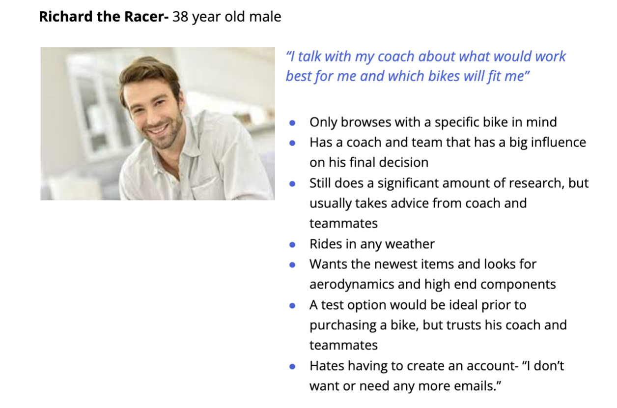
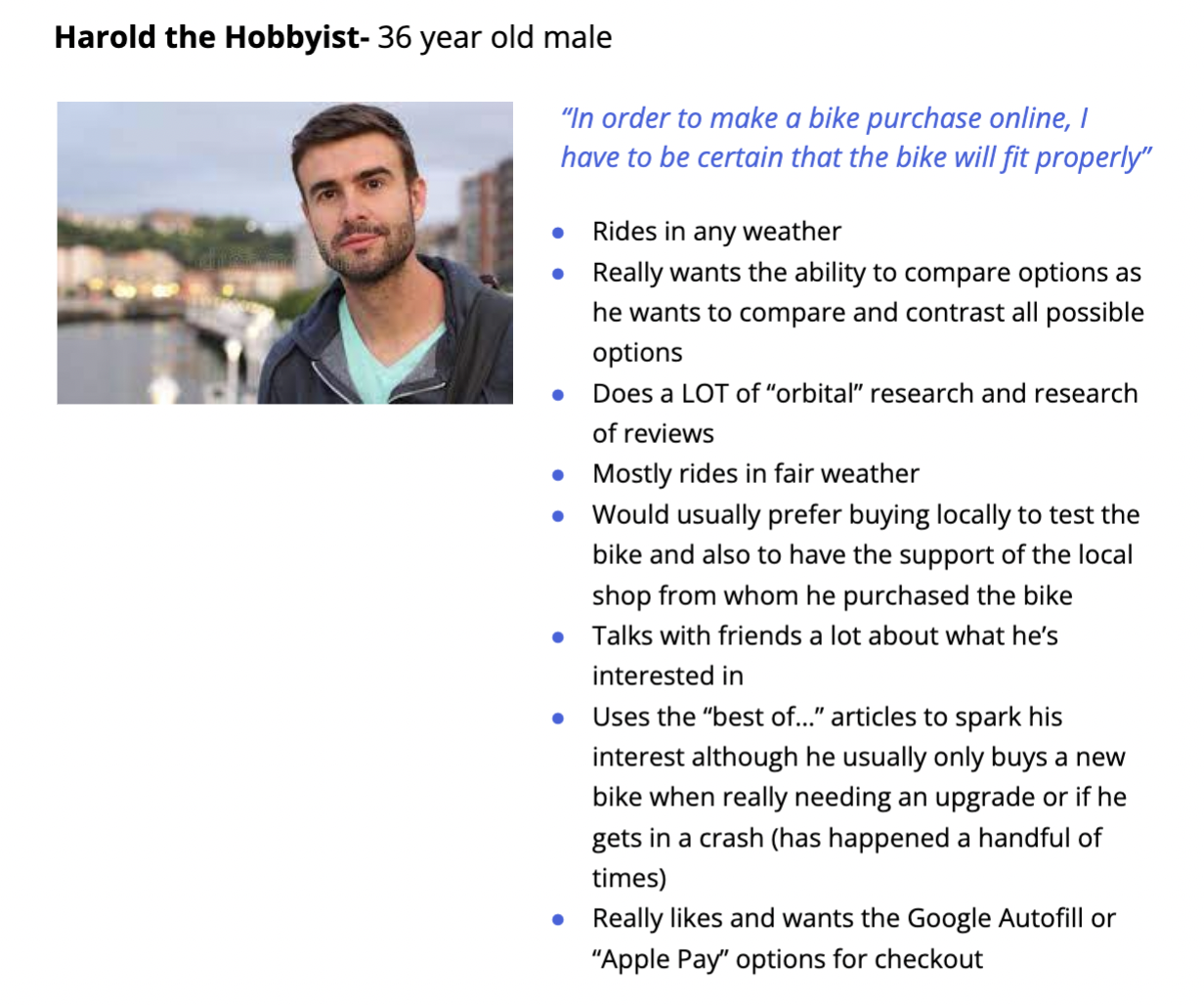

Though the project manager indicated the majority of Koppenbike’s users are men, I wanted to include a female user because they are still key users. Additionally, I wanted to include a commuter as a persona rather than just a competitive and hobbyist cyclist, because even the competitive and hobbyist cyclists are commuters.
Regarding the process of searching for a bike, several interviewees mentioned being overwhelmed by the amount of options. Even if they have a general idea of what they are looking for, they have found that the information provided on specific bikes (and their components) can be daunting. Additionally, those who knew what they would want (generally the competitive and hobbyist cyclists), wanted the ability to compare a couple or several similar bikes. For the users who aren’t necessarily sure which bike is best for them (given their specific needs), most websites remain overwhelming even if filters are available. This is because there are drastically different types of bikes (mountain bike versus road bike), so the users don’t know where to start.
Many interviewees also mentioned doing a lot of research prior to making a large purchase (in this case, a bike). One interviewee said he uses a lot of “orbital websites” (or websites that aren’t affiliated with a particular product, but discuss the product) to be able to make a more informed decision. Other interviewees also mentioned doing their research and also wanting proper support for their questions when seriously considering the purchase of a bike. Another interviewee mentioned that in a recent bike purchase, she contacted the company and was able to speak with a company representative which not only helped her make a more informed decision but also helped her develop a positive view of the company, therefore creating a positive brand relationship.
My thought going into redesigning the browsing process was, how can we create an informative search process (for both users who know what they are searching for and those who do not) that isn’t overwhelming and provides the support that will ultimately leave the users with a positive outlook of Koppenbikes?
When it came to the checkout process, many interviewees mentioned a guest checkout and/or a Google autofill or Apple Pay option makes the checkout process much easier. Only one interviewee admitted to completely abandoning a site at a checkout when required to create an account or sign in, however all interviewees indicated they are put off by a site that requires them to sign in or create an account.
With this information, I wanted to create several user flows to define and implement, the features with which I wanted to redesign the website. The user flows include: initial search flow, comparison flow, quiz flow and checkout flow:
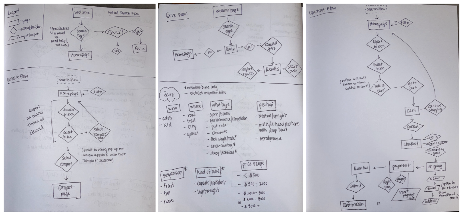
From the user flows, I went into the initial low fidelity frames. I knew this should include the comparison tool, the quiz for the search process, as well as an improved checkout process.

For my initial usability testing using my low fidelity frames, I selected 4 participants who fell within the same demographics as the initial interviewees from the Discover stage. I asked that the participants complete several tasks while navigating my low fidelity prototype.
These tasks were:
• Preview a bike
• Compare multiple bikes
• Select the genre of bikes you would like to browse
• Complete the quiz to help find the proper bike
• Complete the purchase of a bike
I asked the 4 participants to vocalize their thoughts and frustrations while completing these tasks. After completing each test, I went through my notes from each test and grouped similar and significant findings/issues together based on priority.
The following issues were “critical”:
Issue #1
Summary: “Help me!” tab for quiz is not obvious
Recommendations: Create a pop up or initial card on the homepage to introduce the quiz instead of creating a tab
Issue #2
Summary: Compare button not very obvious
Recommendations: Make compare button really pop when it is available. Perhaps create a pop up that explains that user needs to click on the button to complete the compare process
Issue #3
Summary: Some areas are particularly wordy with descriptions that aren’t quite universal
Recommendations: Make phrasing/wording on each page more accessible/universal
With these identified issues, I focused on the critical issues, making updates to the function of the website using the recommendations I developed. This drove the process to build my high fidelity frames. The Koppenbikes brand reflects a personality of an expert in the cycling field who is always knowledgeable about the very latest trends and best products related to biking. Attributes of the brand include being savvy, focused, serious and dependable, so I wanted the website colorways to reflect this brand identity. Therefore, I chose a dark yet simple and sleek look:

After creating the first round of my high fidelity frames, I used the same tasks from the first usability test for my second round of usability testing with 5 new participants. The following issues were identified, for which I came up with recommendations:
Issue #1
Summary: Quiz feels forced as the first item seen on the main homepage screen
Recommendations: Create a “hero story” to set up as the main story on the homepage and direct user to the quiz option below the hero story on the homepage
Issue #2
Summary: Previous searches or preferences don’t appear to be saved
Recommendations: Create a “saved” or “save for later” option
Issue #3
Summary: There are a lot of words on the more detailed pages
Recommendations: Use more imagery - more specifically, use color option boxes instead of a dropdown menu for the color options
From this second round of usability testing, it became clear that the initial information presented to the user (particularly on the homepage) was off-putting. Users also indicated they would want to “save” an item for later and also expected more imagery. In addition to the second round of usability testing, I reached out to a mentor for feedback. He suggested minimizing the size of the screen and changing around the background color to allow the images to pop for the user. With the recommendations and feedback I received, I completed a final iteration of my high fidelity frames for the redesign of Koppenbikes:

Ideally, I would have been able to continue iterating my design and performing additional usability tests until I felt I had a final redesign that was complete. Due to the time constraint of my course, I was only able to perform two usability tests. I would have liked to do an additional usability test after my final iteration, especially to see if there would be positive feedback given the drastic change of the UI. I also would have wanted to gain additional insight on the general flow of the users’ search process.
Regardless of my inability to complete a third usability test after my last iteration, the biggest changes made from the original site into my final prototype were the addition of a comparison tool between multiple bikes, a “save for later” option, a quiz to identify the best bike for the user, and a guest checkout option. Ultimately, users were impressed with the comparison tool and found it to be helpful in their search. Many users noted this feature would “definitely help [them] make an informed decision.” Regarding the checkout process, all users were pleased to have the guest checkout option with the ability for an “easy” checkout for a quick purchase with the click of a button (such as Apple Pay or PayPal).
Previous to this redesign project, I had not designed a website, and more particularly, an e-commerce website. I gained valuable skills in project redesign within a holistic perspective of designing a website. I believe the updates made will increase the conversion rate, therefore achieving the goal of the project.