

What would it look like to have all expectations laid out when connecting with potential roommates with the goal of having a more comfortable living situation? Dwellers is a roommate search app that helps users connect with potential roommates with whom the user would be comfortable in their home.
June 2021 - November 2021
Research Analysis • Product design • Design systems • User-testing
Determine how to make the transition into a new living situation with a new compatible roommate (in a new city) simpler and more successful.
It can be really stressful not only to find a roommate but also find a roommate who shares similar living space expectations as well as social expectations (for example: if one roommate expects to have dinner together nightly, etc.)
To begin, I focused on several “How might we…?” questions that I wanted to initially use as a reference going into my research. These included:
- How might we alleviate the stress of finding a roommate for users new to the search (for roommates)?
- How might we prevent users from obscuring their cleanliness habits?
- How might we determine roommate personality and lifestyle compatibility?
- How might we address the circumstances in which someone needs a roommate? (i.e., rushing to find roommate or leisurely searching…)
- How might we confirm roommate communication is productive?
I hoped to discover some solutions to these questions when doing my subsequent research.
To begin my primary research, I interviewed 5 individuals who were selected based on their answers from a screener survey, which confirmed each participant held these characteristics:

I then created two empathy maps that represented the two types of users (and potential personas) I could identify from the interviews: user seeking a friend for a roommate and user not necessarily seeking a friend, but just someone to take space. However, after creating the empathy maps, I felt that there was too much of a gap between the two users and that there should be someone in between. Therefore, I created three personas, which I felt best encapsulated the population of potential users of Dwellers:
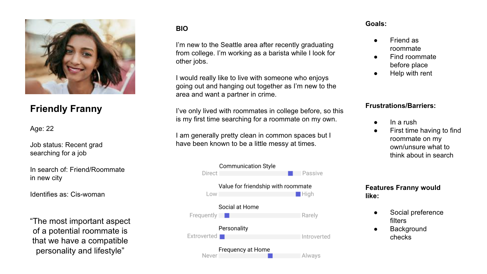
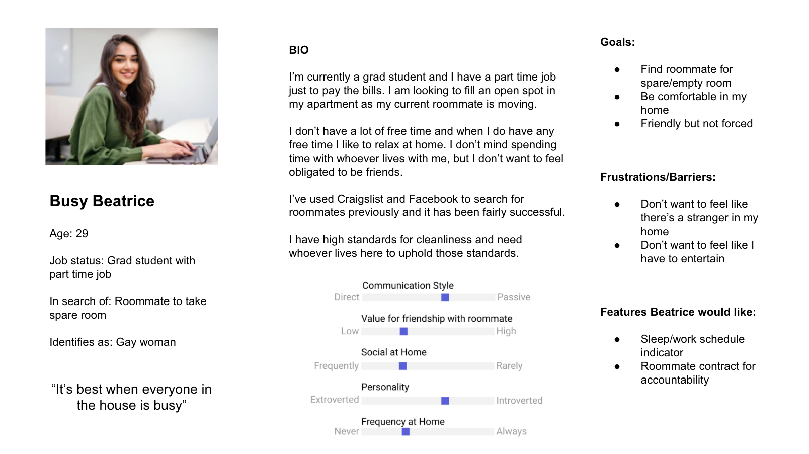

The biggest change from the initial two personas from the empathy maps to my final three personas was the addition of the third user, which allowed for a happy medium between the user wanting friends and the user not wanting a friend. The third user is someone not necessarily seeking a friend but wanting a roommate who is friendly and willing to spend time with their roommate.
Ultimately, I found that there were underlying circumstances for why someone needs or wants a roommate. Several people indicated that they tend to be more non confrontational in their communication toward others, however they preferred to receive direct communication. So how can we bridge the gap between the preferred communication style one communicates themselves and how they prefer to be communicated to?
Similar to communication, and gleaned in the secondary research, cleanliness standards are incredibly important for most people. However, how one perceives their own cleanliness habits may differ significantly from how another perceives them.
Regardless of a user wanting the roommate to be a friend or just a cohabitant, it appears a similar lifestyle and personality between roommates would positively impact the relationship. Those who didn’t necessarily want their roommate to be their friend wanted a similar sleep schedule as well as similar social habits (for example: those who may not want to be friends, did not want someone who is a homebody to be their roommate).
With the initial research completed, it was time for me to develop a sitemap (below) which I used to create individual user flows based on the different personas.

.jpg)
.jpg)
From the user flows, I then went into the initial sketches. I knew I would need to include a detailed sign-up process for a user to create a profile, which I included in my sketches prior to my first guerrilla test. The sign-up process would definitely become the most extensive.
You can view my low fidelity sketch prototype here.
Moving on to the guerrilla testing, I found 5 additional participants who fell within the same demographic as the initial interviewees from my research and asked that they run through the sketches prototype. From the guerrilla testing, the most important discoveries from each participant were:
- Filtering options: each participant desired a filtering option on the homepage as a way to decrease the pool of options from which to choose.
- Map/Location: specifically on the “about me” page each participant wanted a map option to be more visual in pointing out the locations where they would like to live.
Using the feedback I obtained from the guerrilla testing, while also keeping in mind the previously created user flows to ensure I was considering what I needed to prioritize, I created low fidelity wireframes:

To transition these low fidelity wireframes into high fidelity wireframes, I needed to define my brand personality and character.
Dwellers understands the importance of having a quality roommate who is compatible with our user to provide a comfortable living environment.
Keeping the brand attributes and personality in mind, I developed high fidelity frames:
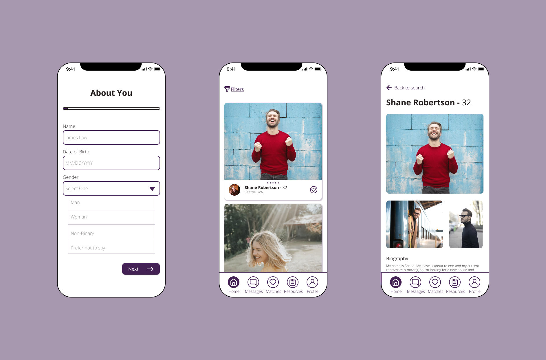
I added the primary color purple to the app which creates both a fun yet secure feel. For the home page, I created cards for the user to scroll through to be able to browse other users whom they could "favorite." The individual profile pages are scrollable and provide the user more information about the potential roommate.
Using the prototype I performed my first round of usability testing. Prior to the test I was hoping to discover answers to the following questions first with the sign-up process:
I asked 5 participants to go through my prototype and complete several tasks while vocalizing their thoughts and frustrations while trying to complete the tasks. The 4 tasks were:
1. Create an account/profile if you are new to the app and would like to use it to find a roommate who fits your lifestyle.
2. You found someone on your homescreen who looks like they could be a good fit for you! Indicate you would like to “match” with them.
3. You want to narrow your search results on your home screen based on your preferences; try to do this.
4. You’ve matched with someone and now you want to get to know them better; start a conversation!
After the testing was complete, I went through my notes and grouped issues together based on priority. The following issues were “critical.” I made recommendations for iteration on those “critical” issues:
Issue #1
The map under the location page created the most frustration for each test participant; each participant wanted to be able to zoom in on and click on the map rather than select from a list.
Summary:
- Participants tried multiple times to zoom in on the map
- Participants tried to click on the map to select their desired location
- After trying to zoom in on and select the map directly, participants would then click on the search locations text box which provided a list of options for places to live
Recommendations:
- I recommend creating a clickable map for users to select the neighborhoods they would like to live in
- I recommend also keeping the list option for those who already know the neighborhood(s) in which they’d like to live
Issue #2
Participants indicated the messaging should only be available after different users “matched”
Summary:
- Participant clicked on message from the homepage looking at a profile as it was an option
- Participant mentioned that messaging function should only be available after users “matched”
Recommendations:
- Remove messaging option from profile pages under the homepage
- Only allow for messaging button to be available under profiles under the match tab
Issue #3
Price range page created pause
Summary:
- Participants felt that the “set amount” option was redundant/unnecessary
- One participant felt that having a “price floor” would be helpful
- Ultimately participants found that the range was what was necessary and the “set amount” option deterred their attention unnecessarily
Recommendations:
- Remove “set amount” option and only have the price range slider scale available
After iterating on my design based on the recommendations above, I ran another round of usability testing with 5 additional participants. I asked them to complete the same 4 tasks from the first usability test. These were the findings:
Issue #1
Summary: Several participants wanted the ability to filter their connections
Recommendations: Create a similar filter as used on the general homepage, under the connections tab; create a way for users to compare multiple connections with one another and “prefer” one over the other to narrow down their connection results
Issue #2
Summary: Several participants wanted the ability to “undo” a task or remove a connection
Recommendations: Create a button on each individual profile page under the connections tab that allows the user to remove that selected connection
Issue #3
Summary: Though only one person, Tim, had pointed this out, there was no notification visibility if he were to have matched with someone when not logged into the app
Recommendations: Create a notification alert, likely a small red circle with the number of notifications under the particular tab, either a new connection or a new message, on the bottom toolbar
Ideally, I would have been able to continue iterating my design and performing additional usability tests until I felt I had a final product. However, due to the course curricula, I was to only perform two usability tests.
The most significant changes I would have made after this last usability test are to include a filtering option under the connections page, similar to the homepage. I also would have created notifications for users to be able to be notified when they had a new connection.
Being able to follow the process of initial research into analysis and through multiple iterations of design was so eye-opening and helped me better understand each step needed to develop an app. I definitely went into this project with my own perceptions of what would be needed for a roommate-search app, but doing the research and getting feedback helped me create a more well-rounded and user-friendly app!