
.jpg)
How can we provide a directory of sorts with existing public spaces from which the Post Up users can select a space to work?
November 29 - December 7 (2021)
Research • Analysis • Interviews • Product design • User-testing
Follow the GV style design sprint based on design thinking methodology. A one week sprint with 5 stages/days: map, sketch, decide, prototype and test. Then develop ideas and solutions, and build my prototype
Post Up is a collaborative website/app for freelancers to bounce tips, resources and advice off of each other. It is primarily a networking space. There have been discussions among freelancers about trying to find public spaces to do work between meetings.
According to the team behind Post Up, many users mentioned frequently searching for public spaces in which they could do work between meetings. This problem was particularly challenging because the public spaces suggested through this app feature should be based on user preferences and feedback.
The project manager provided the initial research from which I could pull relevant and necessary information. This included an interview with Nina, a 32 year old freelance copywriter. She is on the go a lot and unsure where to go between meetings as she finds herself between meetings hoping to find a place to work for a few hours, about 3 times a week. Ideally, she would be able to take phone calls and potentially meet with people in these public spaces. She is unfamiliar with the city she is in so she spends a lot of time searching for places to “post up” but isn’t always successful in finding a very good space to do so.
From this interview and other research information provided to me by the project manager, I pulled several insights:
• Amenities sought: wifi (free is preferred), bathroom, food, outlets, “basic amenities”
• Knowing/understanding how busy/crowded a space is
- Not necessarily how busy a place is (with regard to ordering food), but whether or not it is too loud and/or if there is enough space to ‘post up’ and spread out/work
- Want a space that is welcoming to a collaborative atmosphere/used to people working from the space
- Able to take phone calls and meet with people without it being too noisy
• Searching for a space can be really time consuming with a poor outcome
- Users want proximity (close to them)
- Want to ensure there are appropriate amenities available
- Want to ensure it has the space to post up and work
- End up digging through reviews and jumping back and forth between different websites/apps
- Several interviewees mentioned liking to see photos of the physical space to ensure there is space to work from
- Food and drink are nice but the physical working space and the amenities available are the most important

Moving onto day 2, my focus was on sketching. In order to spark ideas, I completed a solo Lightning Demo, looking at how competitors solve a problem similar to mine and even looking at products that solve a similar problem in a different area of engagement. During the lightning demo, I looked at: Zillow, Yelp, AirBNB, Google Maps, and MealMe. The most significant ideas were sparked by Zillow and Yelp:
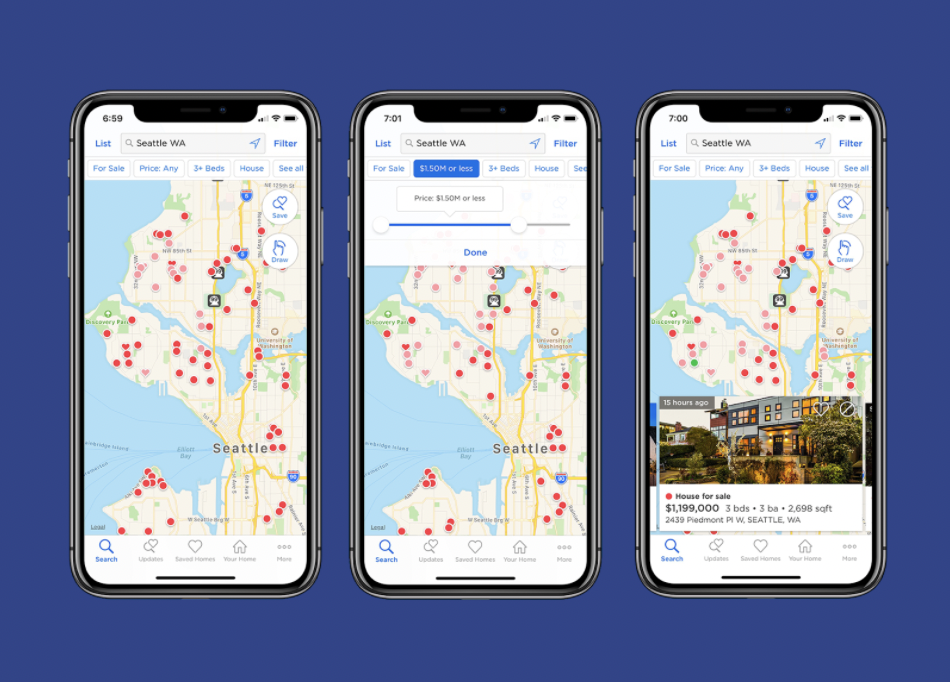
I selected Zillow because of its search feature and because options are filtered from the map. It caters to people looking for places to purchase/rent based on their location. The user can filter results based on preferences.
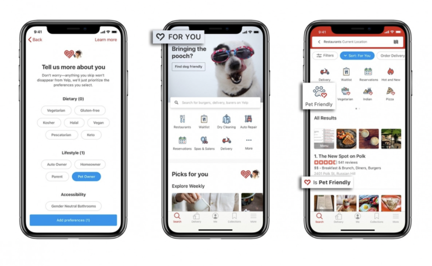
I chose Yelp because it is basically what Post Up needs to solve the problem, but at a grander scope (used to locate all sorts of business/restaurants/etc, instead of just work spaces). Yelp provides users photos and all the information for the business. The list format is useful however a map format would also be helpful. Yelp does a good job of listing amenities and providing the basic business information (whether or not something is open or not, the hours, the price range, etc).
After sparking some ideas from the lightning demo exercise, I did a Crazy 8’s sketch in order to push beyond my first idea of what this product would look like. Here is what I came up with:
From this exercise, I selected the filtering screen as the most critical screen because the preferences are what matters most for the user to ultimately find a location that best suits them in their current circumstance. For the solution sketch, I found that the critical screen became the actual filter page and the screen I’d identified previously became the “results” screen after having selected the filters. Both the filter screen and results screen are critical, however the filter screen is slightly more critical because the filters are what allow the user agency in finding the right location for them:
Day 3 was filled with a lot of decisions. I started with the three screens from my solution sketch. I then identified areas from which the user may want to expand, for example, adding a review or saving a location for a later time. Another feature that is important is the “checking in” feature which indicates a user is currently at the space and it allows the user to make a personal note to themselves as to their happiness with the space and whether or not they would come back again/what they liked about the space/etc.
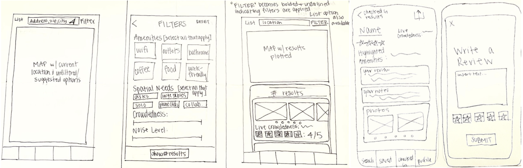
Here are the decided upon screens I made to complete my storyboard:
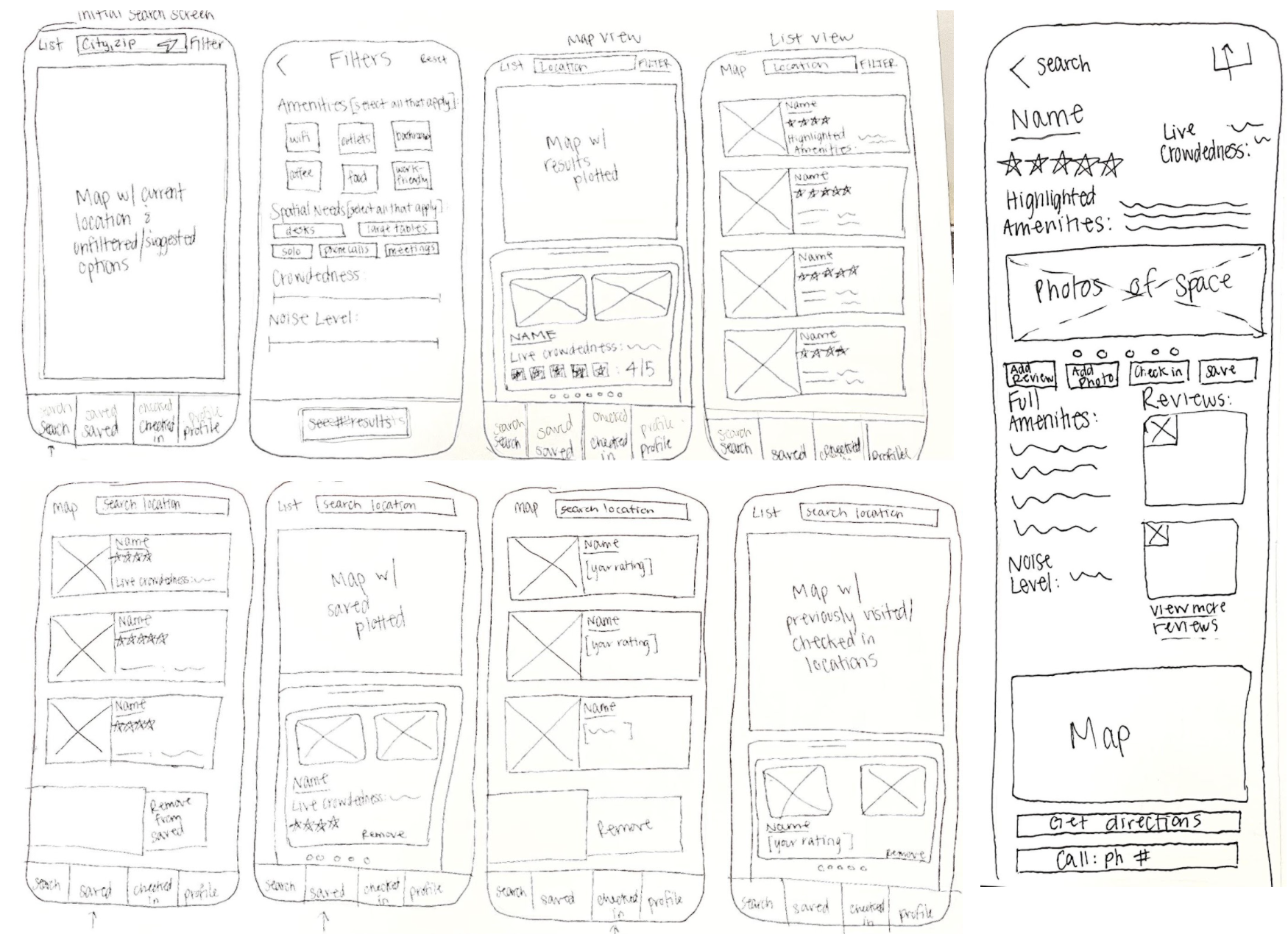
I did find myself wanting to expand on different features and got carried away/distracted from the main problem a few times and had to reel myself back in to make sure I was focusing on the problem at hand; creating a more seamless process for the user to get from searching for a location, to picking and going to the location (and later reviewing the space [to make public for other potential users- like a social media platform] and potentially adding photos).
A big day of prototyping went into day 4.

Ultimately, this process seemed quite straightforward given my initial map creating the end-to-end user journey, however I did find myself wanting to add more features which led me to taking a “risk” to give the user an option to add a note when they checked in.
Taking a retrospective look at my sprint, I got a bit carried away in adding more small features that pulled the user from their basic tasks.
Here is the final prototype.
On the final day, I completed 5 usability tests of my prototype. I connected with 5 individuals who have experience needing a space to work in new cities, or even in their own cities, but in new areas. In order to find people to interview who would likely fit the description of a Post Up user, I reached out to several friends who I know work as freelancers, and asked that they connect me to other freelancers they may know. From this, I was connected to Drew, Joe, Niel, Nadine and Jenna.
For all usability tests, I asked each user to complete 3 tasks:
1. You are in a new area and would like to find a place to work from between meetings. Find a space from which you’d like to work.
2. You’ve made it to the space you selected to visit. Indicate you’ve made it and browse options to share your experience.
3. You found a space that looks interesting, but won’t have a chance to go now, indicate you’d like to visit it at some point in the future.
When I first selected this design sprint, I did so because I felt I could relate to the product. So, it was really fun to interview people with like minds who helped me by providing constructive feedback and providing insight that will ultimately improve my prototype.
It was hard for some users to get over the prototype aspect of the test; meaning, parts of the prototype were not ‘clickable’ or ‘scrollable’ when they wanted it to be clickable or scrollable, but when I further explained that this was a prototype and not everything would work as seamlessly as they may want, they were able to continue with the test. I did, however, ask that they constantly speak aloud to describe their thinking process and express their frustrations as well as what they liked about the product and its functionality. As the test went on, each user became more and more comfortable speaking their minds.
ISSUE #1: “Checked in” and “Saved” tabs are redundant/ “Checked in” sounds like a reservation
SUMMARY: Multiple, if not all users were confused by the difference of “checked in” and “saved”. The general thought was that it would be nice to “bookmark” or “pin” a location to indicate they’ve been there but to also indicate they would be interested in visiting there in the future, but all in the same place instead of having one tab for those they’d been to and another tab for those they’d like to go to. One user even mentioned wanting a note option for the locations he’d “saved” because he’d want to know why he saved it more than wanting a note to himself about how the space was that he’d visited, “that’s what the review is for and what is shared.”
RECOMMENDATION: Combine both tabs into a “bookmarked” or “pinned” tab and have an indicator (either a flag or pin icon) on the selectable screens in the lists to show that they’ve previously been there and then another indicator (maybe another flag icon or star) to show those they’ve not been to but are interested in visiting. Also keep the note feature for both.
ISSUE #2: Map is not clickable
SUMMARY: Several users didn’t go to the filtering option at first- they wanted to browse locations within close proximity first, without any filtering options.
RECOMMENDATION: Allow map to be clickable to browse options within close proximity to the address/location selected.
**That said, options initially available to browse will be pulled from a general database, such as coffee shops and work spaces recommended by the users- therefore the app will ‘learn’ and add more options as the app progresses and gains popularity**
I would love to participate in a design sprint with a team in the future. I enjoyed experiencing my first design sprint by myself, but I do see how going through a design sprint with a team could be really innovative and fun!